Akagi Pro Type Specimen Book
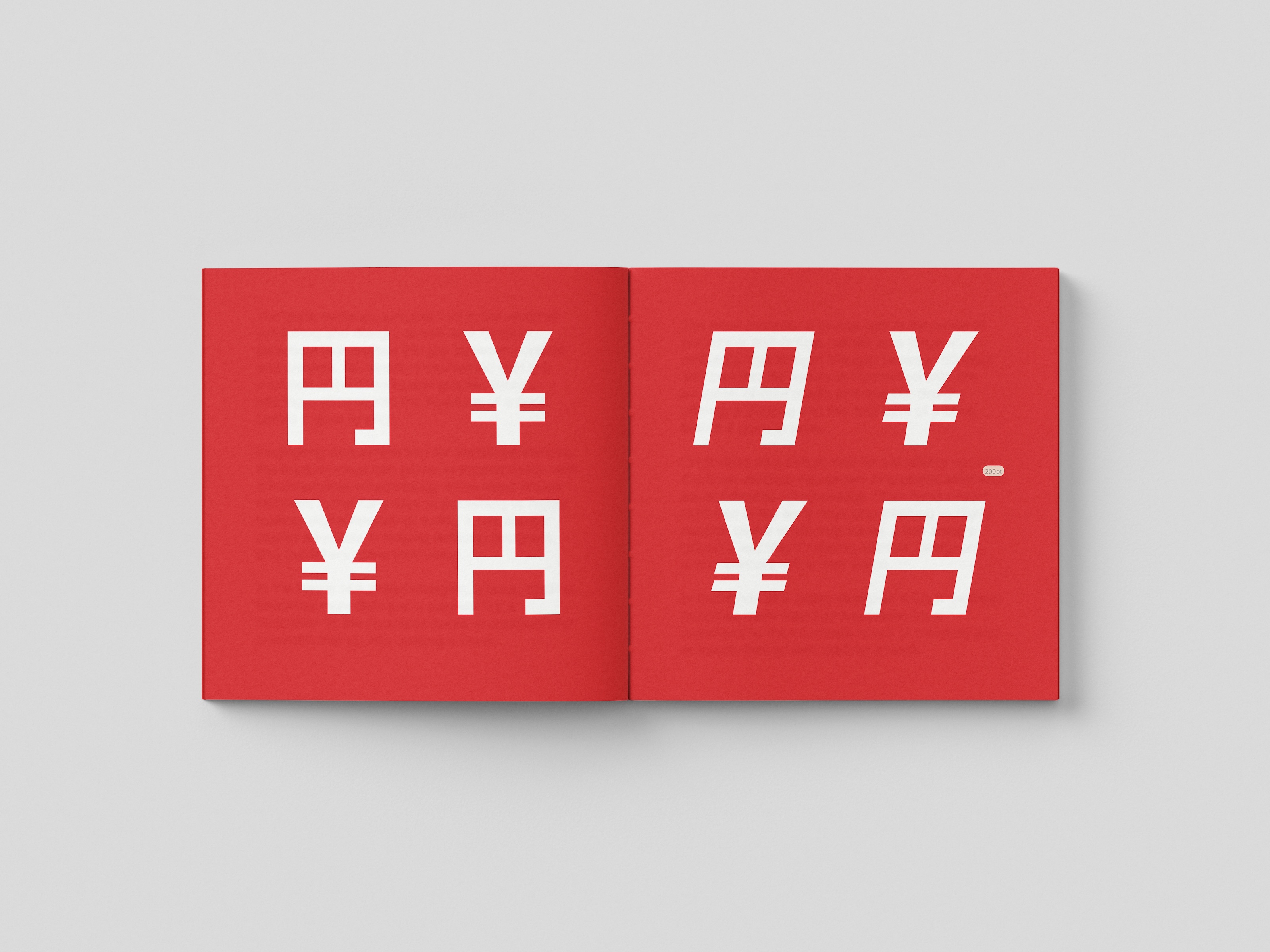
The brief for this project was to design a type specimen book that captures the essence of a chosen typeface. This specimen book showcases Akagi Pro from the American type foundry Positype. I opted for a minimal design approach that evokes the spirit of Akagi Pro as a typeface. The colour palette is simple, featuring red and white, which represent the Japanese flag, along with black. When considering the format of my type specimen book, I chose a square booklet as a subtle nod to one of the font’s inspirations: the characters of the Japanese language. These characters fit perfectly within the proportions of a square. However, instead of setting even margins right in the centre of the page, I drew inspiration from the work of Hochuli and Kinross to define the margins, creating a balanced appearance. This design reflects the intended blend of Japanese and Western aesthetics, much as the typeface itself does.


